
How to Plan the Perfect Gallery Wall
A well-designed gallery wall can transform a room, turning a blank wall into a personal statement filled with art, memories, and character. It's also one of the easier design projects to get wrong, usually because people start hanging before they start planning.
In our fifty-plus years helping Bay Area homeowners, collectors, and designers frame and display their work, we've seen what makes a gallery wall sing and what makes it fall flat. Here's what we've learned.
Start with a Purpose
The most cohesive gallery walls have a guiding idea behind them, even a loose one. That might be a subject (travel memories, family portraits, black-and-white photography), a period or style (vintage posters, mid-century prints), or simply a feeling you want the wall to evoke.
Having a theme doesn't mean everything must match. It means there's an intention behind the choices — and viewers can feel that, even if they can't name it.
Choose the Right Location
Gallery walls work well in living rooms, dining rooms, hallways, staircases, home offices, and bedrooms. When selecting a wall, think about viewing distance. A large wall in an open living room benefits from larger anchor pieces that read from across the room. A narrow hallway calls for something more intimate, where people will naturally slow down and look closely.
Lighting is worth considering early too. Natural light, directional spotlights, and picture lights all change how framed work looks on the wall — and how much UV protection your glazing choice needs to provide.
Decide on a Frame Style
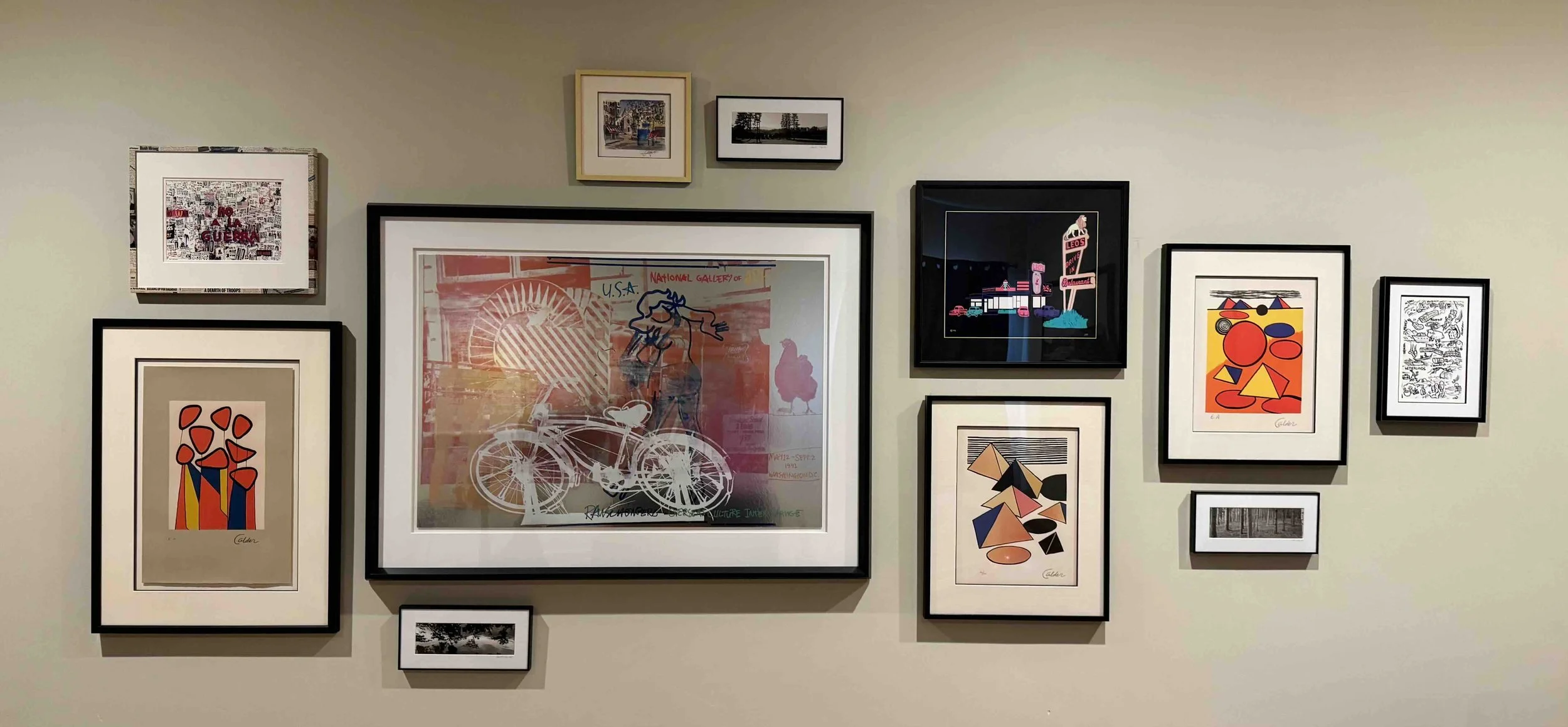
You have two broad directions: cohesive or collected.
Cohesive means matching or closely coordinated frames — same finish, same profile, or the same mat color throughout. This approach creates a clean, intentional look that works especially well for family photographs, black-and-white photography, and contemporary interiors where the wall is meant to feel designed rather than accumulated.
Collected means a mix of frame styles, finishes, and periods. Done well, this feels layered and personal — like the wall has been built over time rather than purchased all at once. It suits vintage artwork, travel souvenirs, antique maps, and eclectic collections. The key is finding at least one unifying element, whether that's a consistent mat color, a shared tonal palette, or a recurring frame finish — to keep the mix from reading as chaotic.
Neither approach is better. The right choice depends on the pieces themselves and the room they're going into.
Plan the Layout Before You Hang Anything
This is the step most people skip, and it's the one that matters most. Hanging one piece at a time and working outward by feel almost always produces an unbalanced result — and a lot of unnecessary holes in the wall. Instead, try this approach:
Get a large piece of craft paper that is slightly larger than the size you have planned for your gallery wall. Place this on the floor.
Lay your frames on the floor on top of the paper and experiment with arrangements until you find one that feels right. You’ll want to experiment with spacing and placement during this step.
Once you're happy with the layout, trace each frame's outline onto the paper. Take a photo of the arrangement too — it's easy to lose track of which piece is which when frames are similar in size.
Tape the paper to the wall. This lets you see exactly how the finished arrangement will look before a single nail goes in.
Mark your nail placements directly on the paper, then hang through it. Tear the paper away when you're done.
This process takes an extra thirty minutes and saves hours of second-guessing.
Anchor the Arrangement with One Strong Piece
Every successful gallery wall has a piece that does the organizing work — something the eye naturally finds first, and that everything else relates to. This anchor is often the largest piece, but not always. A striking photograph, a mirror, or even a particularly bold frame can serve the same function.
Position the anchor first, then build outward. Placing it slightly left of center, or lower than you might expect, can make the arrangement feel more dynamic than perfectly centered symmetry.
Get the Spacing Right
Consistent spacing is one of the clearest signals that a gallery wall was planned rather than improvised. As a general guide, 2–3 inches between smaller pieces and 3–5 inches between larger ones works well. The exact numbers matter less than the consistency — random gaps make even a beautiful collection feel unfinished.
One thing we often tell clients: err on the side of tighter spacing. Gaps that feel comfortable on the floor tend to look wider on the wall, especially as you step back.
Mix Sizes Thoughtfully — and Don't Forget Objects
Visual interest comes from variety. A wall of identically sized frames, however well-chosen, tends to feel flat. Aim for a mix of at least two or three size categories — one or two larger anchor pieces, several medium works, and smaller accents to fill gaps and add rhythm.
Gallery walls don't have to be limited to frames, either. Mirrors, decorative objects, small shelves, wall sconces, and sculptural elements can all be incorporated into the arrangement. A custom framed mirror, in particular, adds depth, reflects light, and creates a natural focal point. Mixing framed and unframed elements is one of the things that gives collected gallery walls their personality.
Consider Matting Carefully
Matting is often the last thing people think about and one of the first things that shapes how a wall reads as a whole. A consistent mat color — most often white or off-white — can pull together pieces in very different frame styles and make a mixed arrangement feel intentional. Matting:
Creates visual breathing room
Enhances artwork presentation
Adds sophistication
Helps unify different pieces
When displaying a variety of artwork styles, consistent matting can tie everything together beautifully.
Don't Forget About Conservation
It's easy to focus on the visual side of a gallery wall and not think about what's happening to the artwork inside the frames. Acidic mat boards and backing materials gradually migrate into paper-based artwork, causing yellowing and staining that develops slowly and often can't be reversed. UV light — from windows and interior lighting alike — fades colors and weakens paper fibers over time.
At Richard Sumner Frames, all of our framing is conservation framing. Acid-free materials, archival mounting, and protective glazing are part of every project we do, not an upgrade. For a gallery wall that includes original artwork, meaningful photographs, vintage pieces, or anything you'd want to pass down, this matters.
Common Gallery Wall Mistakes
Hanging Everything Too High: The center of the arrangement should generally fall near eye level.
Using Frames That Are Too Small: Tiny frames can appear lost on large walls.
Ignoring Scale: A large wall requires enough visual weight to fill the space.
Inconsistent Spacing: Random gaps can make a collection feel chaotic.
Skipping the Planning Process: Taking time to map out your design almost always produces better results.
Final Thoughts
A gallery wall is one of the most personal design features you can add to your home. The planning process — choosing the pieces, working out the arrangement, selecting frames that do justice to what's inside them — is part of what makes the finished wall feel like yours.
If you're planning a gallery wall and would like help with frame selection, layout design, or conservation framing, we'd love to work through it with you. Book a consultation or stop by our Palo Alto studio — we're open Monday through Saturday, 10am to 3pm.